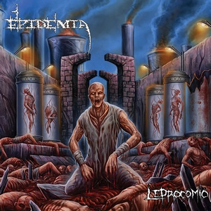
As the push towards a digital age continues to march forward, the need for relevant art and design remains. Take a gander at Epidermia’s second effort, Leprocomio, and it’s hard to argue that the band nailed their sound with that front piece. You know the general guidelines of what to expect, and that’s not a bad thing – especially considering the very crowded marketplace of today.
Let’s take a closer look – there’s bodies everywhere, so you know that you are dealing with death metal. The coloring and design of it all harkens back to memories of late ‘80s/early ‘90s, so you know this isn’t going to be of the tech-y variety. The band and title font also factor into this as well. Wouldn’t you know that those descriptions really hit key facets of Epidermia’s sound. One might say that this is a bad thing, but it’s easy to counter said argument. No one is going to check this one out without knowing what they are getting into, but there are still a few nice surprises to look into. First off, as the art description fits, you might not expect some of the more melodic leads that you find here (check out “Miseria Introspectiva”). There’s also a nice balance of various influences from the time period, without sounding like a carbon-copy of any of them, with nods towards Cannibal Corpse, Sepultura, Sodom, Immolation, and Suffocation. There’s more to it than that, but we’ll leave a small bit of mystery for when one clicks the play button. Just know that Epidermia are relentless in their approach, but keenly aware that 35 minutes of blasting isn’t going to do anyone any favors.
South American death metal that can wield both brutality and subtle hues of melody, Leprocomio is a force to be reckoned with. It may have taken the band a rather significant amount of time to get around to this sophomore effort, but there is no slumping in sight.


